
Loading...
Loading...
Loading...
Loading...
Loading...
Loading...
Loading...
Loading...
Loading...
Loading...
Loading...
Loading...
Loading...
Loading...
Loading...
Loading...
Loading...
Loading...
Loading...
Loading...
Loading...
Loading...
Loading...
Loading...
Loading...
Loading...
Loading...
Loading...
Loading...
Loading...
Loading...
Loading...
Loading...
Loading...
Loading...
Loading...
Loading...
Loading...
Loading...
Loading...
Loading...
Loading...
Loading...
Loading...
Loading...
Loading...
Loading...
Loading...
Loading...
Loading...
Loading...
Loading...
Loading...
Loading...
Loading...
Loading...
Loading...
Loading...
Loading...
Loading...
Loading...
Loading...
Loading...
Loading...
Loading...
Loading...
Loading...
Loading...
Loading...
Loading...
Loading...
Loading...
Loading...
Loading...
Loading...
Loading...
Loading...
Loading...
Loading...
Loading...
Loading...
Loading...
Loading...
Loading...
Loading...
Loading...
Loading...
Loading...
Loading...
Loading...
Loading...
Loading...
Loading...
Loading...
Loading...
Loading...
FPT Data Suite supports registration and login using third-party social media accounts:
Google Account
Facebook Account
FPT Data Suite supports the following registration and login methods:
Via FPT ID - Use your FPT ID for seamless authentication.
Via third-party social accounts:
Google Account
Facebook account
The Quick Start section helps new users become familiar with FPT Data Suite efficiently. It provides essential instructions to begin analyzing data on the platform.
Contents:
Login and Registration: Guides users on creating an account, logging in, and managing personal or organizational information.
User Interface: Introduces the main interface layout, navigation bar, work area, and key components of FPT Data Suite.
Tutorials: Provides step-by-step guides for connecting to data, creating reports, and sharing dashboards with colleagues.
🧭 If you are new to FPT Data Suite, start here to build a strong foundation before exploring advanced features.
For SSO integration, please contact FPT Data Suite via our support channels. Our team will then coordinate the connection with your system.
Greetings from the Data Suite Development Team at FPT Smart Cloud
We are a team of experienced engineers and data specialists dedicated to developing Data Suite — a modern Business Intelligence (BI) platform designed to support medium to large enterprises, as well as individual users, in seamlessly transitioning their data analytics infrastructure to the cloud. Our mission is to deliver a solution that is fast, flexible, and secure, enabling organizations to harness the full potential of cloud-based data analytics.
After you log in, the user interface is divided into two main areas:
Left Sidebar: This is where you'll find navigation to the primary functions of the application.
Quick Access (on the right): Use this section to quickly open your starred reports (those you've marked as important) or your recently accessed reports.
Announcements & Updates: Stay Informed About FPT Data Suite
The Announcements & Updates page compiles the latest information related to FPT Data Suite, including:
New Feature releases
Product Improvements & Enhancements
Changes in system appearance or behavior
The Announcements page provides important updates from the FPT Data Suite development and operations team, including:
Scheduled maintenance
Policy and terms of use changes
Major releases
The Release Notes page provides version-specific updates for the FPT Data Suite platform. Each note typically includes:
New Features – Newly added functionalities that enhance usability and expand system capabilities.
System Improvements – Performance, interface, or UX optimizations.
Bug Fixes – Issues resolved based on user feedback and internal testing.
System maintenance notice
Incident alerts
We encourage you to visit this page regularly to:
Stay updated on newly released features
Track changes that may impact your workflow
Plan ahead based on scheduled maintenance
Monitor service status during interruptions
⚡ Each update includes a brief note to help you understand the change and apply it effectively in your work.
Operational warnings and service interruptions
📌 The Announcements page ensures users stay promptly informed about important updates, proactively manage their use of FPT Data Suite, and collaborate with the support team as needed.
Breaking Changes – Important updates that may affect existing configurations or integrations.
✨ Purpose: Help users and technical teams track update history, understand new changes, and prepare for smooth adoption and integration.


Open a browser and go to https://datasuite.fptcloud.com/.
To log in to FPT Data Suite, you must have an activated FPT ID account. Follow these steps:
Open a browser and go to https://datasuite.fptcloud.com/.
Open a browser and go to https://datasuite.fptcloud.com/.
To log in to FPT Data Suite, you must have a registered Google account linked to the platform. Follow these steps:
Open a browser and go to https://datasuite.fptcloud.com/.

FPT Data Suite is designed to deliver a comprehensive and flexible data analytics experience, available across various platforms to meet diverse user needs.
Access via browser at: https://datasuite.fptcloud.com
Provides full features for data analysts and system administrators.
Best supported with Chrome browser.
For users with Windows 10 or later operating systems.
Supports devices running macOS Catalina or later.
The Desktop App is optimized for viewing reports, dashboards, and monitoring data on the go
Download on .
Download on .
The Mobile App is optimized for viewing reports, dashboards, and monitoring data on the go.
Every version ensures data synchronization, guaranteeing continuity in your workflow regardless of the platform you use.
The sidebar is the main navigation area of the software and includes the following components:
This section helps you manage your organizational context:
(1) Organization details: View information about your current Organization and allows switching to another Organization if the user is active in multiple Organizations.
(2) Home: Navigates back to the homepage of the active Organization.
(3) Workspace management: Lists Workspaces (smaller units within an organization) and enables switching between Workspaces if the user is active in multiple Workspaces within the selected Organization.
The availability of functions depends on the user's license and assigned permissions. Unlicensed features will be hidden.
GENERAL: Core system functions for building and managing reports.
Report: Access and create the various reports.
Data Warehouse: Manage the data sources.
Data Model: Set up and adjust the data models.
Provides shortcuts to frequently used and bookmarked reports.
Recent Tasks: Displays a list of recently performed tasks, allowing users to quickly track and access them.
Manage Organization: Allows users to configure and manage organizational information.
Template Marketplace: A repository of sample report templates.
Documents: Provides access to software documentation and user guides.
The software currently supports two languages: Vietnamese and English.
Business Intelligence (BI) refers to a collection of processes, technologies, and tools that enable organizations to collect, process, analyze, and visualize data to support timely and informed decision-making.
BI empowers organizations to:
Review historical performance
Understand the current business situation
Forecast future trends using data-driven insights
Objective: Deliver the right information to the right users at the right time, transforming raw data into actionable insights that support business strategies.
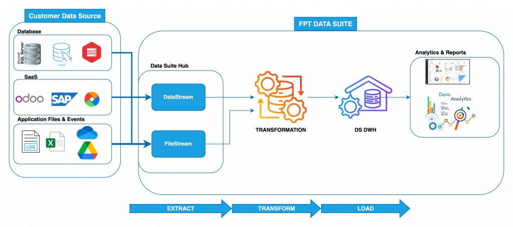
The typical flow of data in a BI system includes:
Data Collection – Gather data from multiple sources
Data Transformation – Cleanse, standardize, and convert data
Data Storage – Save in a structured data warehouse
Data Analysis & Visualization – Create visual reports and dashboards
📌 In FPT Data Suite, this workflow is implemented through:
Data Connector → Data Pipeline → Data Visualization
Business Intelligence (BI) offers powerful tools to help organizations analyze and make informed decisions through six core functions:
Decision Support Identify business issues and support strategy planning using real-time data.
Querying & Reporting Automatically generate structured, meaningful reports from large data sets.
Online Analytical Processing (OLAP) Rapid multi-dimensional analysis, supporting trend evaluation and financial reporting.
Statistical Analysis Interpret data patterns to uncover underlying trends and business behaviors.
To start using FPT Data Suite, you must create an account. Follow these steps:
Activate Your Account
Check your email for an activation link and follow the instructions to activate your account.
Log In
Use your Facebook account to log in to FPT Data Suite.
To log in to FPT Data Suite, you must have a registered Google account linked to the platform. Follow these steps:
Access the homepage
Open a browser and go to .
Select Continue with Facebook account
Click the “Continue with Facebook account” option.
Displays starred (favorite) reports for quick access. Each report displays: name, original workspace and expansion options (3 dots).
Tab next to “Quick Access”, displays reports that the user has recently opened.
The software supports 2 display modes: Canvas and List
Each report is displayed as a card with:
Image (snapshot) of the report
Report name
Workspace
Icon (favorite)
Suitable for users who want to:
View reports intuitively.
Quickly identify through images/charts.
Prioritize easy-to-see, friendly interfaces.
The report will be displayed as a vertical list:
Report Name
Icon (favorite)
Workspace
Update Date
Suitable when you want to:
Manage a large number of reports.
Search or compare reports quickly.
Focus on text content instead of images.


Decision Making – Use insights for operational or strategic decisions
Forecasting Predict future performance and industry trends to proactively plan ahead.
Data Mining Extract meaningful information from large data sets to solve specific business challenges.
Data Sources
Origin of data such as CRM, ERP, databases, APIs, spreadsheets, etc.
ETL/ELT Processes
Methods for Extracting, Transforming, and Loading data into a central repository
Data Warehouse
A centralized, structured storage optimized for querying and analysis
Analytics Tools
Tools to visualize data through charts, tables, dashboards, etc.
Reports & Dashboards
Interfaces that present data in a user-friendly and interactive manner


Log in to your Facebook account, and you will be redirected to the FPT Data Suite homepage.


SETTING: Configuration tools for managing access and user roles.
User Groups: Manage the user groups.
Members: View the list of users within the current Workspace.
User Role: Define and assign user roles and permissions.
EXTENSIONS: Additional software modules that are enabled for use.
User Information: Displays the user's avatar, name, and email. Clicking on this section allows the user to:
Log out
Change password
Switch the interface language


Details and usage instructions will be added in an upcoming update. Stay tuned!
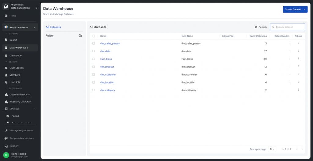
A Dataset corresponds to a table of data from a connected data source.
Components of a Dataset:
Dataset Source: FPT Data Suite creates Datasets from one of two sources:
File source (e.g., CSV, Excel, Google Sheets)
DWH available table source
Dataset Fields Information
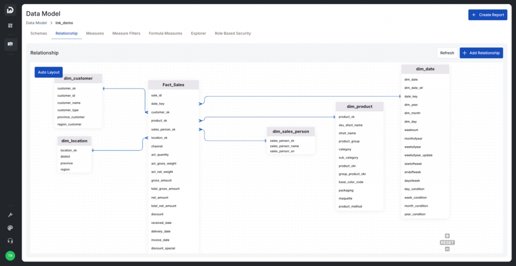
In FPT Data Suite, a Data Model is a general data structure used to organize and manage information within a user's reporting system.
Each Data Model consists of multiple Datasets and is referred to as a schema, representing separate groups of data tailored to different user needs.
Each Report is built based on a specific Data Model. A single Data Model can be reused across multiple reports without needing to recreate it from scratch.
The Support section provides users with essential resources to answer questions and troubleshoot issues when using FPT Data Suite. It serves as a valuable extension of the product documentation, helping users save time on searching and quickly connect with the technical support team when needed.
Details and usage instructions will be added in an upcoming update. Stay tuned!
The video below shows the steps to create a report with some basic chart types.
In the digital transformation journey, data is no longer the exclusive domain of technical departments. It has become the core "fuel" that drives efficient business operations, enables timely decision-making, and shapes growth strategies. However, many Vietnamese enterprises still face significant challenges in leveraging data, including fragmented systems, complex BI tools, high investment costs, and a shortage of skilled professionals.
While international BI platforms often require complex implementation and large budgets, most small and medium-sized enterprises (SMEs) lack the capacity for comprehensive data investments. As a result, manually consolidating, cleansing, and analyzing data from sources such as accounting software, CRM, ERP, or Excel remains a persistent burden. Non-technical staff—such as those in accounting, HR, or marketing—struggle to generate reports independently, which leads to delays or data-lacking decisions.
These are datasets created from existing tables in the Data Warehouse (DWH).
To create these datasets, users log in to the FPR Data Suite system, select a workspace, and navigate to Data Warehouse > Refresh.
The system will automatically generate datasets corresponding to each available table in the DWH.
FPT Data Suite allows users to choose between two types of databases for storing reporting data:
Shared Database: This is a shared database, centrally managed by FPT Data Suite. It is suitable for smaller customers, those with simple requirements, or without available infrastructure. FPR Data Suite assigns each Workspace to a separate Schema, ensuring data isolation.
Customer Database: This is a private database owned and operated by the customer (which can be on Cloud or On-premises). FPT Data Suite will connect to this database using configuration information provided by the customer. Private database connection information is encrypted and only used in the runtime environment.
FPT Data Suite currently supports the following database types:
FPT Data Suite allows users to create Dataset from files containing data in CSV, Excel, or Google Sheets format, and transfer this data into the database.
The video below demonstrates the steps to create a dataset from a source file.
These are elements not directly tied to data or numerical values, such as charts, slicers, or filters.
In the Report design interface, aside from data-driven elements, users can also add presentation and layout components to enhance visual appeal, guide interpretation, and improve the overall user experience.
Add Text: Insert a text box
Customers need to contact FPT Data Suite through support channels to the Data Suite team for advice or register via the link .
FPT Data Suite supports Single Sign-On (SSO), enabling users to access the entire ecosystem quickly and securely with just one login. This brings several key benefits:
Seamless Experience: No need to remember or manage multiple accounts.
Safe & Secure: Easily integrates with multi-factor authentication (MFA) for enhanced account protection.
Centralized Management
If you can’t find the answer in the FAQ, the FPT Data Suite team is always ready to assist you through the following channels:
Hotline: 1900 638 399
Support Portal:
Email: [email protected]
User Group is a feature that allows administrators to manage users in groups, simplifying authorization, data access control, and system role assignment in the FPT Data Suite system.
Each User Group can be configured in detail through the following functional tabs:
Permissions
Inventory Org
The FPT Data Suite system enables access control not only at the functional level (via RBAC) but also at the data level, ensuring that users only see the information relevant to their role and scope—even when viewing the same report.
You can configure row-level data filtering rules directly within the report, based on attributes such as:
Does Data Suite require technical expertise to use? No. Data Suite is designed for both non-technical users and data professionals, featuring an intuitive drag-and-drop interface for creating reports and charts.
What data sources can I connect to? Data Suite supports many popular data sources such as Excel, Google Sheets, SQL databases, APIs, and various ERP, CRM, and cloud platforms.
Can I share reports with colleagues and clients? Absolutely. You can share reports via secure links or export them to Excel.
Add Image: Insert images from external sources into the report. This can be used to:
Display logos (e.g., company or product branding).
Add illustrative visuals that are not part of the data.
Enhance the layout by using images as backgrounds or decorative elements.
Add Button: Insert interactive buttons to create navigation and interactivity in the report. Buttons can be configured to:
Navigate to other pages within the same report.
Link to external reports.
Open reference content or related documents.
Tree Slicer (Infinite Dataset).
A slider-based filter that lets users filter data within a specific range of numeric values.
A time-based slider that enables filtering of data over a specific date or time range. It includes:
Date Range – for fixed start and end dates.
Date Range Relative – for dynamic periods (e.g., "last 7 days", "next 30 days").
Flexible Identity Options: Supports both internal users and external partners through various authentication methods.
Users can flexibly choose from several login options based on their needs:
FPT ID: Log in with your own FPT username and password.
Organization Account: Integrate with an enterprise’s internal identity provider using protocols like SAML or OIDC.
Google Account: Sign in quickly using a personal or business Google account.
Facebook Account: Convenient login using a Facebook account, suitable for casual or external users.
Source Data
System Roles
Adjustment Roles
Branch, Region, Organization
User Roles
User ID or other custom attributes
Example: A revenue report will automatically show only data for the Central region if the user belongs to that region.
Refer: Role-Based Sercurity
Reports can also be configured to display data based on the User Group of the viewer. This provides a more granular control mechanism, aligning access with organizational structure and user responsibilities.
Refer: User Group
Is my data secure? Yes. We apply modern security standards including data encryption, granular column-level access controls, and two-factor authentication to ensure your data is always protected.
Can I assign user roles (admin, viewer, editor, etc.)? Yes. Data Suite supports role-based user management, allowing you to control who can view, edit, or share reports.
Is there technical support if I run into problems? Yes. We offer support via email, live chat, and comprehensive documentation. Premium plans may include SLA-based technical support.
Hanoi Office: FPT Tower, No. 10 Pham Van Bach, Cau Giay Ward
Ho Chi Minh City Office: 3rd Floor, PJICO Tower, 186 Dien Bien Phu, Xuan Hoa Ward


Establish Relationships
Define Measures
Create and set up Filters


Border: Change border thickness and style.
Click Preview to see the updated chart before saving.

A Report Page is the main workspace for presenting data. Each page can include charts, tables, slicers, text, images, buttons, and more — helping users understand and interact with data for specific objectives.
Users can configure a page in the report using the following options:
Users can enable or disable Landscape Mode.
When disabled, the page is displayed in Portrait Orientation.
Users can modify the height of the page using the Scale Height setting:
Scale Height = 1: Default height
Scale Height = 2 / 3: Doubles or triples the default height — suitable for reports with longer content
Users can adjust the grid resolution on the Report Page to better support the arrangement of components:
Default: When this option is turned off, the system displays the grid at the standard resolution.
High Resolution: When turned on, the grid is displayed at a higher resolution, allowing for more precise alignment of objects.
Draft: The page is saved as a draft. Only users with editing permissions can view or modify it. → To save as draft, click Save as Draft after editing.
Published: The page is made available to end users in View Mode. → To publish, click Publish when you're ready to share the report.
Depending on your analysis needs, you can choose from three types of column and bar charts:
Column Chart: Clustered column, Stacked column, 100% Stacked column
Bar Chart: Clustered bar, Stacked bar, 100% Stacked bar
These charts are used to display and compare data across different categories. Each bar represents a specific category, with its height or length indicating the corresponding value. They are ideal for visualizing comparisons across groups or over time and are commonly used in business and finance to represent key metrics such as revenue, expenses, and profit.
A Waterfall Chart visualizes how an initial value is affected by a series of intermediate positive or negative values, leading to a final result. Named for its resemblance to cascading water, it helps users understand the cumulative effect of sequential values. This chart is particularly useful in financial analysis to track things like profit changes, budget flows, or variance explanations.
A Line Chart is used to show the trend or movement of a variable over time or along a continuous scale. It typically includes one or more lines representing data points connected by straight segments across the x and y axes. It's effective for highlighting trends, patterns, and fluctuations.
An Area Chart is a variation of the line chart where the area between the line and the x-axis is filled with color. This type of chart emphasizes the magnitude of values over time, highlighting not just the trend but also the volume represented.
A Pie Chart is a circular chart divided into slices to illustrate numerical proportions. Each slice represents a category's contribution to the whole. Pie charts are useful for showing relative percentages and distributions, and are widely used in statistics, education, business, and research.
A Combo Chart combines column and line graphs into a single visualization, allowing the comparison of two datasets with different units or scales. This is helpful when analyzing relationships between different types of data simultaneously.
Displays raw data in a structured tabular format with rows and columns, similar to an Excel spreadsheet. Each row represents a record, and each column corresponds to a specific data field.
A Matrix Table displays data in a pivot-style layout. It supports grouping at multiple levels and allows users to expand or collapse rows/columns. It’s especially useful for showing hierarchical data and summarizing large datasets.
The FPT Data Suite system is designed with multi-layered security architecture, ensuring data protection, tight access control, and compliance with enterprise-grade security standards.
Single Sign-On (SSO): Supports login via trusted platforms such as FPT ID, Google, Facebook, or organizational identity providers (via SAML / OIDC).
Multi-Factor Authentication (MFA): Adds an additional layer of protection by requiring a second verification method beyond username and password.
Token-Based Authentication: Uses industry-standard protocols like OAuth2 and JWT to securely manage user sessions.
Role-Based Access Control (RBAC): Manages user permissions at multiple levels — Organization, Workspace, and Report. Each role defines clear access scopes.
Flexible Sharing: Allows reports to be shared with individuals or user groups, while controlling what data and functionality they can access.
Data-Level Security: Ensures users only see the data they are authorized to access — even when viewing the same report — by applying row-level filters or access conditions.
FPT Data Suite, developed by FPT Smart Cloud, is a comprehensive platform for data analysis and visualization. Designed to address data management challenges for businesses of all sizes, it enables easy data access and actionability. Guided by the philosophy of “powerful for experts, simple for everyone,” FPT Data Suite empowers any employee-even those without technical expertise-to create reports, analyze data, and make informed decisions using intuitive drag-and-drop tools.
The platform supports a variety of organizational models, helps optimize costs, and is easy to deploy and scale-making it an ideal solution for organizations seeking a modern, user-friendly, and cost-effective BI platform.
FPT Data Suite includes modern analytical tools for all user levels. Its intuitive interface enables the creation of interactive charts, pivot tables, and slicers, facilitating effective multidimensional data exploration. It also supports relational data modeling and calculated fields to unify data across multiple sources.
Data integration is seamless with popular sources like Google Drive, OneDrive, and Pub/Sub, and performance is enhanced via an analytical data warehouse architecture. The platform is compatible with open-source tools such as Airflow, DBT, Spark, and Logstash, offering high flexibility and customization for real-world operational needs.
Security is reinforced with a multi-layered framework: site-to-site VPNs, Single Sign-On (SSO), organizational hierarchy-based access controls, IP restrictions, and row-level security. The solution complies fully with Vietnamese regulations, including Decree 13/2023/ND-CP on personal data protection and Decree 53/2022/ND-CP on domestic data storage.
Notably, FPT Data Suite can process up to 2.5 TB of data in just seconds, making it ideal for large-scale enterprises and data-intensive industries like finance, manufacturing, logistics, and omnichannel retail.
What sets FPT Data Suite apart is its blend of modern technology and deep understanding of the Vietnamese business landscape. Its pay-as-you-go model based on actual usage helps reduce upfront investments and operational costs-potentially saving up to 40% compared to traditional BI systems.
Automated data processing, aggregation, and visualization reduce pressure on internal teams, lower infrastructure and personnel costs, and shorten deployment times. As a result, businesses can fully focus on data-driven decision-making aligned with strategic goals.
With FPT’s experienced experts offering end-to-end support through a Managed Service model—from consultation and setup to monitoring and optimization—the platform is designed for success. Industry-specific report templates (finance, manufacturing, retail, internal operations, etc.) further enable fast, accurate report deployment without the need for an in-house BI team.
More than just a BI tool, FPT Data Suite is a trusted partner in transforming raw data into real business value. From leadership to frontline teams, anyone can access, analyze, and act on data—quickly, confidently, and effectively.
FPT Data Suite is designed to deliver a comprehensive and flexible data analytics experience, available across various platforms to meet diverse user needs.
Access via browser at: https://datasuite.fptcloud.com
Provides full features for data analysts and system administrators.
Best supported with Chrome browser.
For users with Windows 10 or later operating systems.
Supports devices running macOS Catalina or later.
The Desktop App is optimized for viewing reports, dashboards, and monitoring data on the go
Download on Google Play Store.
Download on Apple App Store.
The Mobile App is optimized for viewing reports, dashboards, and monitoring data on the go.
Every version ensures data synchronization, guaranteeing continuity in your workflow regardless of the platform you use.
Select a workspace, navigate to Data Model, choose the model you want to configure, and open the Measure Filters tab.
Click Create Measure Filter and configure it as needed.
Create a Basic Measure if it doesn’t already exist.
The video below walks through the steps to create a Relationship in a Data Model, assuming the Data Model has been created previously.
Measures are created using aggregate functions (such as SUM, COUNT, etc.) that can be calculated from data.
FPT Data Suite supports Basic Measures (like SUM, AVG, MIN, MAX), and users can leverage these in the report-building process.
Additionally, users can create their own custom Measures for different, more complex calculations to meet specific reporting needs.
The video below walks you through the steps to create a Measure and test the newly created Measure.
Click on the Chart you want to duplicate.

Select a workspace, navigate to Data Model, and choose the Data Model you want to configure.
One-to-One: A record in the From Node is linked to exactly one record in the To Node.
One-to-Many: A single record in the From Node is linked to multiple records in the To Node.
Many-to-One: Multiple records in the From Node are linked to a single record in the To Node.
Hover your mouse over the Report you want to rename.

You can delete a chart using one of the following methods:
You can choose how the image fits within the frame:
Fill: Stretch the image to fill the entire frame. This may distort the image.
Contain: Resize the image to fit within the frame while preserving its aspect ratio.
Cover: Scale the image to cover the entire frame while keeping the aspect ratio. Some cropping may occur.
Also known as a Pivot Table
A Matrix Table is a data visualization tool that allows you to display information across multiple dimensions. Unlike regular Data Tables, which present data in flat rows and columns, a Matrix Table enables the arrangement of dimensions along both rows and columns, with measures placed at their intersections. This creates a grid-like layout where each cell shows an aggregated value based on the combination of row and column dimensions.
Title: The name of the Matrix Table.
Columns: Dimensions and/or measures displayed horizontally.
Rows (Data rows): Dimensions displayed vertically, with support for hierarchical expand/collapse functionality.
Totals: Aggregated values displayed at the bottom of columns and at the end of rows.
Row Pagination: Splits the vertical data when there are too many rows to display at once.
Column Pagination: Splits horizontal data when there are many columns or measures.
Expand/Collapse Rows: Allows you to explore data at different levels of hierarchy for a more detailed or summarized view.
Vertical Paging: Navigate through multiple row groups when the table contains a large dataset.
Horizontal Paging: Navigate through column groups when many dimensions or measures are displayed.
Sort Axis: Sort the table based on the values of any row dimension or measure:
Click the menu icon in the top-left corner of the table to access additional supported functions.
Dimensions: These are elements used to define columns, rows, or groupings in a report or chart. Dimensions are categorical attributes that help group, filter, or segment the data. Examples include product names, regions, departments, or dates.
Legends: A component of a chart that visually distinguishes different data groups. In charts such as column or bar charts, legends use colors or labels to represent various categories like product types or regions.
Metrics: These are quantitative values displayed in charts. For instance, in a column chart, the height of the columns represents a metric such as revenue, sales volume, or profit.
Tooltips: An interactive feature that displays detailed data when you hover over chart elements. Tooltips usually show values for individual data points, helping users gain insights without cluttering the chart interface.
Sort: A function used to order data in charts, tables, or reports—either ascending or descending. Sorting makes it easier to spot trends, outliers, or rankings in the data.
Limit: Allows you to restrict the number of rows, values, or data points shown in reports, charts, or datasets. This is useful when you want to focus on top values or avoid performance issues with large datasets.
Filter Preferences: Enables users or report designers to define how filters interact across components of a report. For example, a slicer can be set to affect only certain charts or tables, giving more flexibility and control in data exploration.
Conditions: (Coming soon) – This section is not yet available or implemented.
Before creating a Report, ensure that you have already:
There are two primary methods to create a new Report:
Bookmark is a feature that allows users to save the display state of a Report Page, including which components are shown or hidden. This enables users to easily switch between different analysis modes without needing to manually reconfigure the layout each time.
To create a bookmark, follow these steps:
On the Report Page, report designers can enable the feature by turning on "Show bookmark" in the top corner. Once enabled:
A bookmark management panel will appear in the report design interface.
A bookmark selection bar will be shown at the top of the report for end users to choose from.
Bookmarks can be used in flexible ways:
Direct Use (Standalone) End users can select a bookmark from the bookmark bar to instantly switch the report view to the saved configuration (i.e., showing and hiding components as specified).
Combine with Buttons You can link bookmarks to buttons in your report. This allows users to switch views with a single click, providing a more intuitive and seamless experience—without relying on the bookmark panel.
For detailed instructions on how to combine bookmarks with buttons, see .
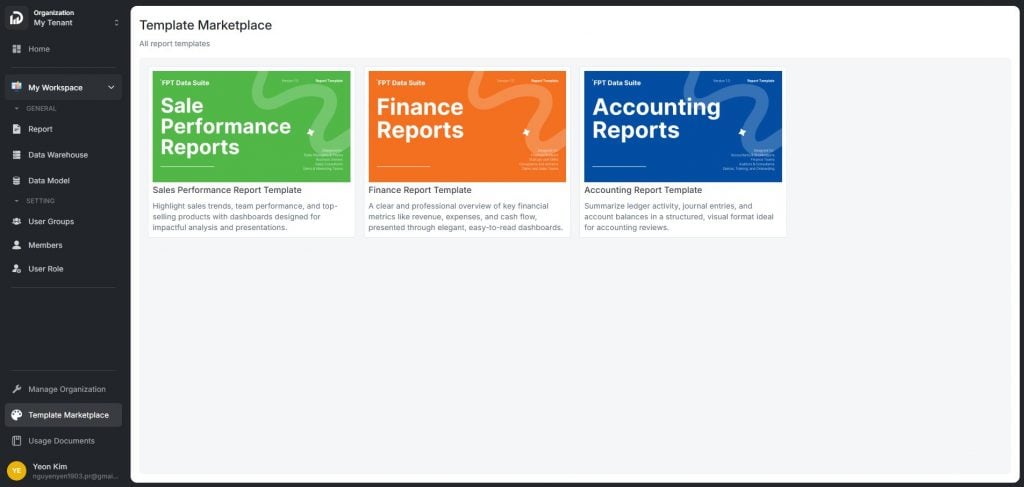
FPT Data Suite provides a library of pre-designed Report Templates that help users quickly get started with commonly used business reports — without having to build them from scratch. Users can select an appropriate template and then customize the data, charts, and layout to meet their specific analysis needs.
This repository offers multiple advantages for businesses:
Save time building reports.
Standardize data presentation and analysis.
Easily customizable to individual needs.
Applicable across various departments: business, finance, accounting, and more.
Sales Performance Report Template
Analyze sales trends, team performance, and best-selling products.
Intuitive layout, ideal for presentations and tracking business goals.
Finance Report Template
This report template library is continuously upgraded and expanded by the FPT Data Suite team to diversify the range of available templates and build a rich, flexible reporting ecosystem — delivering tangible value to every business and user.
Measures are quantitative indicators calculated from data within a Schema. When you create a report or chart, the system calculates these measures based on specified filtering conditions or data groupings.
Enable quantitative analysis and data comparison.
Serve as the foundation for building reports and charts.
Support data-driven decision-making.
FPT Data Suite provides default measures for each dimension in a schema.
For dimensions with data types: Date, Datetime, String, or Boolean, the following aggregate functions are supported:
COUNT
COUNTDISTINCT
MIN
MAX
For dimensions with data types: Number, or Double, the following functions are supported:
COUNT
COUNTDISTINCT
SUM
AVG
FPT Data Suite supports three types of custom measures:
Basic Measure Calculated based on one or more columns of numeric data combined with aggregate functions (such as SUM, COUNT, AVG, etc.).
Filter Measure Dynamically adjusts filter conditions based on the context of each report. Instead of using fixed filter values, this type of measure utilizes user-selected variables (e.g., time, region, segment) to generate contextual results.
Formula Measure Created using custom formulas, allowing users to combine multiple measures — even across different schemas — to produce advanced analytical metrics.
Feature to control how filters affect Charts, Slicers, and Tables
Filter Interaction Control is a feature that empowers users or report designers to manage how filters from one component (e.g. a slicer or chart) affect other components in a report.
Purpose of this feature:
Control the flow of analysis: Guide user interactions and exploration logic in dashboards.
Prevent unintended filtering: Ensure that certain visualizations (e.g. high-level summaries) remain unaffected by specific filters.
Enable advanced interactive reporting: Support the creation of dynamic dashboards, where components can filter or exclude one another selectively.
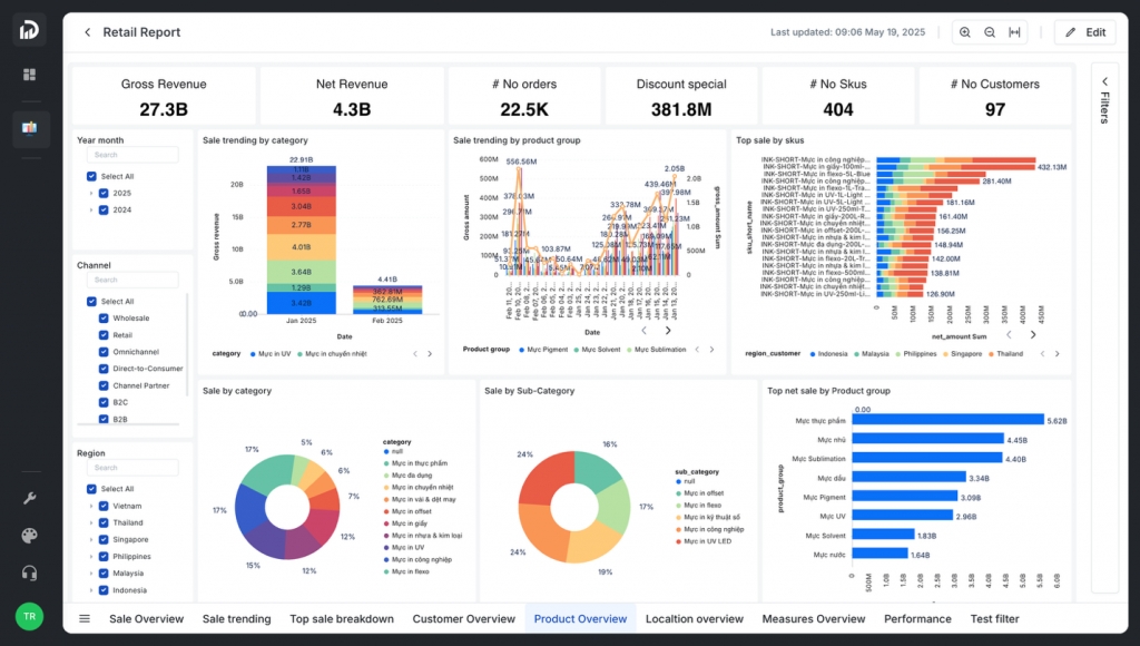
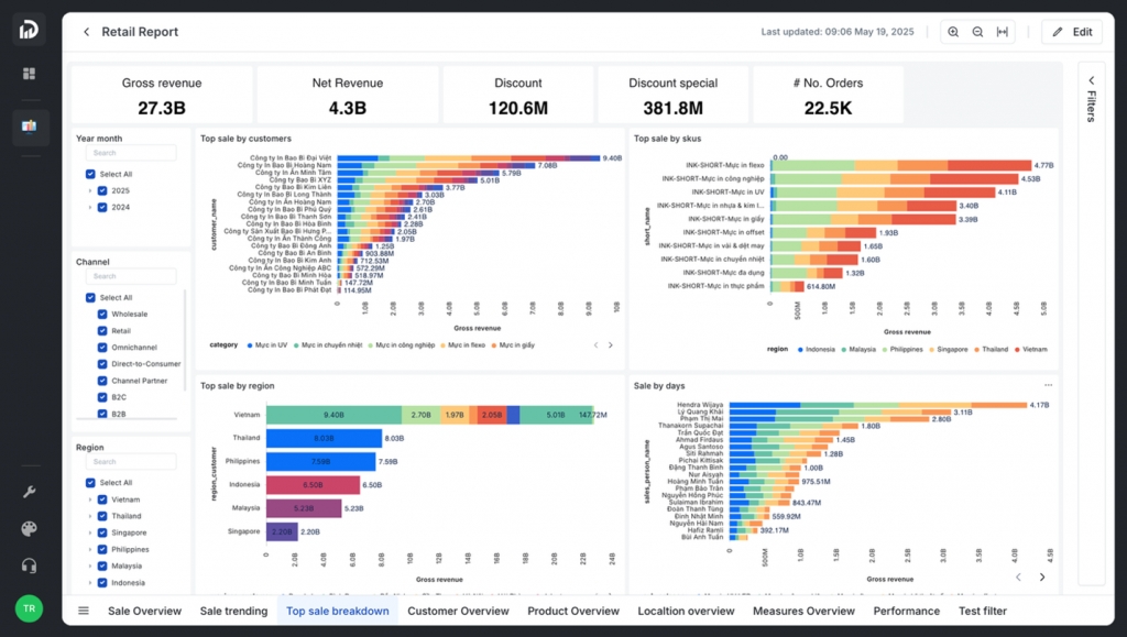
The report screen consists of six main sections:
This area contains the individual pages of the report. For example, in the image above, the report is currently displaying data on the “Page default” page.
The toolbar provides options for customizing the report or the page. Some features may require specific permissions. For instance, depending on your access level, you may or may not be able to edit the report.
This is where slicers, scorecards, and charts are displayed. It presents the visual content of the report based on the configured data and filters.
The Filters pane displays all filters currently applied to the report or the page. To collapse or expand the pane, click the arrow icon (>).
This section allows users to customize visual elements such as chart types, field selections, formatting options, and colors for text and values.
Displays the columns of data from the associated data model (including dimension and fact tables). The data may include numbers, text, dates, and calculated fields.
FPT Data Suite is structured using an Organization → Workspace model to ensure separation, manageability, and flexible authorization across user groups and projects:
Organization: Represents the top-level unit in the system (e.g., a company, corporation, or organization). Each Organization can contain multiple Workspaces and manages users at a global level.
Workspace: An independent working environment within an Organization, typically associated with a specific project, product, or functional team. A Workspace helps isolate data, configurations, access rights, and technical components (such as Reports, Data, Pipelines) between different groups within the same organization.
Segregate data and resources by team or project.
Manage users by role at both the Organization and Workspace levels.
Support flexible scaling and operations across multi-team environments.
The FPT Data Suite system supports access control through two main mechanisms:
Role-Based Access Control (RBAC) Users are assigned roles at either the Organization or Workspace level. Each role defines specific access rights to functions and resources such as:
Viewing/editing Reports
Editing Datasets and Data Models
Managing Pipelines
Ensures secure and precise access control.
Enables flexible collaboration and efficient information sharing among members and teams.
A Primary Key is the field that uniquely identifies each data row within a schema.
Before establishing relationships between Schemas in a Data Model, users must clearly define the Primary Key for each Schema. This ensures the system knows how to connect and compare data accurately. Choosing an incorrect Primary Key can severely affect data analysis quality, leading to inaccurate results in reports and charts.
The Tree Slicer (Infinite Dataset) is an advanced filtering component that enables users to select one or more values from a list to filter data across the entire report page. It is especially useful for dynamic or large datasets and supports use cases such as:
Browsing and selecting values in a tree structure or flat list.
Filtering data across the page by one or more selected values.
Supporting filters by time
SSO – Organization Account is a feature that allows businesses to centrally manage users within their organization, ensuring security and compliance with internal access policies. The system supports integration with identity services such as Active Directory, Azure AD, Google Workspace, etc., via standard protocols: SAML and OIDC.
Conditional Formatting allows users to apply visual styles (like colors, icons, and fonts) to data elements based on their values. Its purpose is to help users quickly identify trends, highlights, warnings, or anomalies in Reports.
This feature is currently supported on the following components:
Data Table: Format cell background, text color, or icons based on each cell’s value.
Scorecard: Highlight KPI values with color or an icon depending on a set threshold.
Pie Chart
Combo Chart
And more...
Select the chart type that best fits your analysis needs.
Legends: Used to distinguish different series or groups visually (e.g. by color or label).
Metrics: The numerical values to be calculated and visualized (e.g. revenue, quantity).
Tooltips, Sort, Limit: Additional settings to enhance interactivity and data presentation (see detailed definitions).
In the Visualizations panel, click on the Style tab.
Customize visual elements such as:
Colors
Chart title and labels
Font size and style
Background and grid lines
This helps improve the readability and aesthetics of your chart.
A professional overview of revenue, expenses, and cash flow.
Emphasis on readability and clarity in financial data presentation.
Accounting Report Template
Summarizes ledger activities, journal entries, and account balances.
Logically structured according to accounting standards, supporting periodic reviews and reconciliation.
COUNTDISTINCTROLLINGWINDOW
MAX
COUNTROLLINGWINDOW
COUNTDISTINCTROLLINGWINDOW
SUMROLLINGWINDOW
AVGROLLINGWINDOW
Configuring system settings
Common roles include: Manager, Member, Viewer, etc.
Resource Sharing In addition to RBAC, the system supports granular sharing for specific resources (e.g., reports). Users can share resources with individuals or groups, with permissions such as:
Viewer: View-only access
Member: Editing access
This promotes flexible collaboration without altering overall permissions at the Workspace or Organization level.
Allowing multi-selection of values.
Enabling quick search within long lists.
Tree Slicers (Infinite Dataset) can be placed in various areas within the Report to optimize filtering and enhance user experience:
Page: Displayed directly on the Report Page for quick access to filter controls without navigating away.
Filter: Placed alongside other global filters for multi-chart or multi-page filtering.
Filter Panel: Displayed in the collapsible filter panel to allow real-time filter interaction without affecting the page layout.
Configuration is done via the Build tab on the right-side panel of the interface. Below are the main configuration options:
Title: Sets the display name of the slicer. Appears above the slicer to help users understand its filtering purpose.
Dimensions
The most important configuration area.
Drag and drop one or more fields from the Data Sample into this section.
When multiple dimensions are added, the slicer displays a hierarchical tree view.
Search Configuration: Controls the behavior of the search function within the slicer. Supported modes:
Text: Searches for exact matches.
Syntax: Supports advanced expressions like wildcards or regular expressions (regex) for flexible filtering.
Limit: Defines the number of values displayed initially. Additional values are loaded when the user clicks "Load more" or uses the search function.
Copy/Paste Confirmation: Enables or disables the ability to show the selection/search box, allowing:
Copying values into the slicer from external sources.
Exporting selected items from the slicer.
Dimension Labels: Adds secondary labels (e.g., names, descriptions) alongside the main dimension (e.g., code or ID). Useful when primary dimension values are not human-readable.
Show on List with Dimension; Toggle whether to display the Dimension Label alongside the main dimension in the slicer.
Keep All Filter: Determine whether the slicer should respond to other filters in the report:
Off: The slicer ignores all other filters.
On: The slicer updates dynamically based on other filters (e.g., from charts or other slicers).
Sort: Controls how values are sorted within the slicer. Configure sorting by selecting a dimension and choosing:
Ascending
Descending
Select the Delete option from the toolbar or right-click menu.


Uncheck the components you want to hide.
Delete a bookmark using the delete button.


Ascending: From smallest to largest (e.g., A–Z, 1–100, oldest to newest).
Descending: From largest to smallest (e.g., Z–A, 100–1, newest to oldest).
Refresh: Reloads data from the source to reflect the most up-to-date values.
Hard Refresh: Performs a full data reload by bypassing any cached data, ensuring everything is retrieved fresh from the original source.
Export File: Allows users to download the current data in .xlsx format. The system supports exporting up to 50,000 rows per file.


Paste text copied from another source.
Use the formatting toolbar above the text box to customize the appearance. Formatting options include:
Paragraph style selection
Font styling: Bold (B), Italic (I), Underline (U)
Color: Set the background color (default is white #FFFFFF).
Transparency: Adjust background transparency (0 = opaque, 100 = fully transparent).
Reset to Default: Restore the text box to its original default style.

Background: Enable or disable the background color for the image container.
Color: Select a background color for the image container (default: white #FFFFFF).
Transparency: Set the image container’s transparency (0 = opaque, 100 = fully transparent).
Display for mobile: Enable or disable image display on mobile devices. This helps optimize the layout for smaller screens.
Reset to default: Restore all style settings to their default values.
Choose the appropriate option >> to move the image behind other elements or use it as a report background.
None: Keep the original image size. No automatic resizing is applied.
Review the information, edit the report display name if needed, and click Create to complete the setup.
Select the Data Model you have already created. The system will automatically assign a default name to the new report, which you can change as needed.


In the right-hand panel under Visualizations → Build, go to the Filter Preferences section. Here you’ll see the toggle to configure filter interaction:
Off: The component will respond to filters from all other visuals as usual (default behavior).
On: The component will only respond to filters from the specific visuals listed in the “Filters applied to this Visual” section.
Note: If the interaction is enabled but no visuals are listed under “Filters applied to this Visual”, the component will not be affected by any filters.
Header (Data Columns): Names of data fields (dimensions and measures).
Rows (Data Records): Each row represents an individual record.
Pagination: Splits the data into pages for easier browsing and management.
Total Bar: Displays the total values of measures at the bottom of the table. When hovering over the total bar, the system will show the number of currently displayed records / total number of records in the dataset.
Change Column Width: Hover over the right edge of a column header. When the cursor changes to a ↔ (double-headed arrow), click and drag to adjust the column width.
Data Page Navigation: For paginated Data Table, users can navigate through pages using buttons or by entering a page number manually.
Infinite Scroll (Auto Load More): When scrolling to the bottom of the table, the system will automatically load more data. Data is loaded in batches of 1,000 rows by default.
Sort Data (Sort Axis): Allows sorting by any column in either direction:
Ascending: A–Z, 1–100, oldest to newest
Descending: Z–A, 100–1, newest to oldest
Refresh: Reloads the displayed data from the source to ensure the most up-to-date information.
Hard Refresh: A deeper refresh that bypasses the cache and forces a complete reload from the data source.
Export File: Allows downloading the currently displayed data to an .xlsx file. Up to 50,000 rows can be exported per file.
Drill Through: Enables users to explore detailed data by clicking on a specific row or value. Upon drilling through:
The system navigates to another report page.
The selected row's value is automatically applied as a filter for charts on the destination page.

Not NULL: A Primary Key cannot contain NULL values, as every record (row) must have a unique identifier.
Only One Primary Key: Each table can have only one Primary Key.
String: A sequence of characters, which may include letters, numbers, special characters, spaces, and more.
Number: Whole numbers (integers without decimal points).
Double: Real numbers (with decimal points).
Date (yyyy-mm-dd): Date values in year-month-day format.
Datetime (yyyy-mm-dd hh:mm:ss): Date and time values in year-month-day hour:minute:second format.
Boolean (true / false): Logical values that can only be either true or false.
Centralized user management
Enhanced security (support for MFA, policy-based access control)
Automatic user provisioning and deprovisioning
Role- and department-based access control
To integrate your Organization Account with Data Suite, the following information must be prepared and provided to the FPT Data Suite support team:
SAML
SSO URL
Entity ID (Issuer)
X.509 Certificate
OIDC
Client ID
Client Secret
Discovery URL or individual endpoints (Authorization, Token, UserInfo)
Once the FPT Data Suite support team completes the integration, they will provide your business with the necessary login details. You can follow these steps to log in:
Visit the homepage - https://datasuite.fptcloud.com/
Each role has its own access rules, defined in the Data Model (e.g., by row-level filters, schema access, or column-level restrictions).
When a user accesses a report, the system automatically applies the corresponding filter conditions based on their role.
Bar/Column with Line Combination Chart: Allows separate formatting rules for each part (bar or line), supporting clearer hierarchical data representation.
In addition to role-based authorization, the system also supports a flexible sharing mechanism for individual Reports. Users can share Reports with other individuals or User Groups, with specific permissions such as Viewer (view only) or Member (edit). This allows for more flexible collaboration without affecting overall permissions at the Workspace or Organization level.
Sharing is applied to each Report, with custom permissions for each shared user (e.g., Report A is shared with User X, Report B with User Y).
FPT Data Suite supports sharing Reports in bulk based on the configuration of each User Group, helping to simplify report distribution with the correct access permissions and data scope.
This feature allows Workspace Admins to:
Save time: Avoid manual sharing of individual reports to each user.
Ensure consistency: All group members receive the right reports with the correct permissions and filters.
Scale efficiently: When new members are added to a group, predefined sharing settings can be applied automatically.


Unlimited
Max File Size
10 MB
50 MB
200 MB
Data Pipeline Support
Limited to 1 pipeline
Yes
Yes
Storage Capacity
1 GB
10 GB*
100 GB
Dedicated System
Not available
Not available
Customizable
Storage Expansion
Not available
Available upon request
Customizable
File Size Expansion
Not available
Available upon request
Customizable
Expert Guidance
Not available
Not available
Available upon request
License
Up to 3 users
Unlimited
Unlimited
Workspace
1
Unlimited
Unlimited
Report Publishing
Not available
Included
Included
Dashboard Template
Pre-built templates included
Included
Included
Data Warehouse Limit
1 GB
100 GB
Use the Copy icon to duplicate a rule and the Delete icon to remove it.


Click Action next to the measure you want to update, then select Edit.
Click Action next to the measure you want to delete, then select Delete.


Once the button is added to the Report Page, users can:
Drag and drop to adjust its position on the page.
Drag the bottom-right corner to resize the button.
In the right sidebar, under the Visualizations → Style tab, users can configure the following properties:
Border: Enable or disable the border of the button container.
Label: Text displayed on the button.
Tooltip: Hint text shown when the user hovers over the button.
Action: Define what happens when the user clicks the button. Two types of actions are supported:
Web URL: Opens a specified link with two display modes:
Same tab: Opens the link in the current browser tab.
New tab
Format: Customize the appearance of the button.
Users can define separate styles for each button state:
Default: Normal state when the Report Page is first loaded.
Hover: When the mouse hovers over the button.
Press: When the button is being clicked.
For each state, the following style properties can be customized:
Width
Button width (in px)
80px
Height
Button height (in px)
36px
Font
Font family used
Inter
Font Size
Font size (in px)
For example, a user can configure the button with the values above to create a button styled as shown in the preview below


Bookmark: Navigates to a predefined report bookmark.
14px
Font Style
Normal or Italic
Normal
Font Weight
Normal or Bold
Normal
Font Color
Text color
White #FFFFFF
Background
Button background color
Blue #154DBD
Border Width
Border thickness (in px)
0px
Border Radius
Rounded corners (in px)
6px
Border Style
Solid, Dashed, or Dotted
Solid
Border Color
Border color
Blue #154DBD


Tree Slicer – Added option to show/hide the search bar.
Line & Column/Bar Chart – Added support for configuring separate data label formats for Line and Column/Bar.
Matrix Table – Added support for displaying columns in a tree view.
Data Table – Added option to freeze columns when scrolling horizontally.
Date Range Slicer – Added support for selecting time ranges using relative dates.
Role-based Security – Added ability to create filters based on user login information.
UI/UX Enhancements
Optimized error messages when users encounter blocked IPs or data loading issues.
Improved usability and functionality of action buttons in error cases, making them clearer and more user-friendly.
Automatic Data Type Detection: The system now analyzes uploaded file content to automatically determine the appropriate data type for each column when creating a new dataset, reducing configuration time and minimizing errors.
Chart – Added styling configuration for percentage (%) data format on Line Chart and Stacked Column Chart.
Report
Allows you to adjust the grid size in reports, making layouts more flexible and precise.
Expands the page and report cloning feature, with improved support for scale height settings.
Dataset Refresh History: Track the full progress of dataset refreshes from upload sources. Detailed information about each refresh process is displayed directly in the job list, allowing you to clearly monitor the current status of your data at any time.
Filter Interaction - Controls the filtering relationship between report elements (charts, slicers, data tables). Allows users to define which elements are affected or not affected by other filters.
Bookmark - Allows to reopen the report with the components hidden/shown according to user needs.
Data Table - Adds a data table view with pagination support. Displays the number of records loaded / total records, making it easy for users to track data loading progress.
June 6, 2025
Release 2.32.0 Web
Report - Button Link: Allows creating a button with a link on the report
Report - Custom Page Size: Allows changing the size of the report page, serving the needs of users who want to track multiple metrics on the same report.
Fix some bugs
May 22, 2025
Data Suite supports importing data from the following file types:
Users can upload new files from these sources:
Supported File Types: CSV, Excel, Google Sheet
Upload Sources:
From computer
From Google Drive
From OneDrive
Size Limit: Maximum 30MB per upload
You can also use files previously uploaded to the system, provided they are still within the allowed storage period.
Follow the same steps as above, but in the Upload File popup, select Google Drive.
Follow the same steps as above, but in the Upload File popup, select OneDrive.
Note: By default, the first row of the file (CSV, Excel, or Google Sheets) is used as the header. Dataset field names are based on these headers.
When you need to modify data (update, add, or delete) in a Dataset that was originally created on the DWH from a file source, you'll need to update and synchronize this data to the DWH.
Note: When updating a file, do not modify its structure—only update its content.
You can:
Update the file locally
Tree Slicer: Added flexible display options for tree nodes, including support for showing Null values.
Duplicate Page/Report: Extended functionality to support duplication in cases where height is adjusted proportionally (scale height).
Adds new styling options, allowing for more diverse and visually rich chart customization.
Hard Refresh - Adds a "Hard Refresh" option to refresh report data according to the latest data source, ensuring accuracy.
Tree Slicer (Infinite Dataset) - Supports displaying additional sub-dimensions and adds the ability to search by both primary and secondary dimensions, helping to filter data more effectively in large data sets.
Fixed an issue where Authentication Redirect kept displaying when logging in with Facebook/Google on Android.
Fixed an issue preventing login with another account after previously using a Facebook/Google account.
Fixed an issue where users could not log in after logging out from the browser.
Fixed UI errors or incorrect error messages when canceling Facebook login.
Filter Preferences - Fixed an issue where Chart/Slicer behaved incorrectly in several cases when combined with “Keep All Filter” and the actor list.
Charts
Area Chart & Stacked Area Chart - Fixed incorrect color display, removed extra line on Android, and aligned stacked order between Web and Mobile.
Scorecard - Fixed incorrect default background color and number formatting (Display units, decimal places).
Table Chart & Matrix Table - Fixed conditional formatting, config Sort, incorrect data display, and inconsistent row order between Mobile and Web.
Drill Down & Conditional Format - Adjusted logic, color display, and corrected behavior for date-based conditions.
Chart Viewer - Fixed highlight issues, filter not applying when selecting slicer for the second time, and missing UI for Number Range slicer.
Tree Slicer - Fixed an issue where “Select All” was displayed even though Single Select mode was enabled.
New Features
Login with Google & Facebook - Users can now log in using their Google or Facebook accounts, offering faster and more convenient access.
Conditional Formatting
Scorecard – Supports applying conditional formatting to scorecard charts, helping highlight key values.
Bar/Column & Line Chart – Enables conditional formatting for Bar/Column Charts and Line Charts.
Data Table – Supports conditional formatting for data tables, allowing value-based contextual customization.
Filter Interaction - The system now supports interaction between Slicers and Charts on the Report Page, allowing more flexible filtering and data analysis.
Report Page
Supports the “Fit to width” feature in Report View mode, enhancing the viewing experience on mobile devices.
Supports Report Pages with more granular grid layout options to improve accuracy and flexibility in chart arrangement.
Bug Fixes
Fixed an issue that prevented users from opening or viewing reports in certain cases.
Resolved a UI bug where link buttons appeared too small, making them difficult to interact with.
Chart Viewer – Enhanced “Show as Table” mode with a Back button and an option to toggle the filter panel.
Bug Fixes
Chart Builder
Fixed popup UI issue when renaming a page.
Fixed issue where duplicated pages did not carry over High Resolution Grid settings.
IAM - Fixed cache issue causing incorrect permission assignments.
Chart Viewer
Fixed issue where the Data Table was hidden by the left navigation bar and could not scroll horizontally.
Fixed incorrect column colors when filters were applied.
Fixed data axis (x-axis / y-axis) not displaying correctly according to the configured format.
Workspace - Automatically select the correct workspace when users access via direct URL.
Score Card - Improved to display ellipsis (…) and tooltips when the content exceeds the available display space.
Bug Fixes
Matrix Table - Column name changes now take effect immediately without requiring a page reload or additional actions.
Bookmark
Fixed issue where newly created bookmarks could not be assigned to a button.
Fixed issue where the button did not function according to the assigned bookmark in specific cases.
Fixed issue where bookmarks did not work correctly in Edit Mode when linked to another page.
IAM (User Management)
Fixed incorrect role display in the user list and in the Invite/Manage User popup after updating roles from the Members tab.
Fixed issue where incorrect report information was sent when adding multiple reports to a user group.
Fixed issue where some nodes in the Org Chart could not be selected when applying filters.
Bug Fixes
Chart
Fixed the issue where Column Chart sorting still included dimensions with no data.
Resolved incorrect color display on Column Chart when filters were applied.
Fixed the Y-axis label not displaying correctly on legacy charts.
Corrected a typo in the "Y-Axis" label on the Style tab.
Scorecard
Fixed value misalignment when using bold formatting in the chart.
Prevented users from creating conditional formatting rules without complete configuration.
Fixed the issue where the <= 0 condition did not work with custom measures.
Conditional Formatting
Fixed the issue where conditions did not apply correctly when using Filter Preferences.
Bookmark
Resolved a crash that occurred when a bookmark pointed to a page that had been switched to Draft mode.
Performance & Stability
Tree Slicer – Optimized performance to reduce CPU and RAM usage when joining with dimensions containing large datasets.
Chart - Allows the X-axis of column charts to be aligned to 0, improving the clarity and accuracy of data presentation.
Chart Bug Fixes
Fixed an issue where filters could not be applied to Formula Measures.
Resolved an issue that caused the application to crash when switching from a Donut chart to a Tree Area chart.
Fixed a bug in Chart Builder that prevented color settings from displaying correctly in the Style section when creating and previewing the following chart types:
Line Chart
Area Chart
Stacked Area Chart
More Flexible Dataset Update Options: The dataset update process has been enhanced with new options. Users can now choose the update method - either append new data or overwrite all existing data - and define the specific data range to refresh. This provides greater control over how data is refreshed.
Scorecard: Added configuration options to format values displayed on the scorecard, including main values and comparison values.
Chart:
Added an option to show/hide Y-Axis labels.
Now supports displaying "∞" (infinity) when dividing by zero.
Matrix Table: Added the ability to show/hide rows and columns related to totals, including Subtotal and Grand Total.
Bug Fixes:
Chart Builder - Fixed an issue where colors were not displayed in the Style section when creating and previewing a chart for the first time.
Chart Display:
Button Link - Enhanced the ability to execute Actions on buttons. Added new Actions that support Bookmarks, allowing users to create a more flexible page-turning experience.
Data Table - Increased the limit on the number of records loaded per batch from 50 to 1,000, helping users view data more smoothly on large tables.
Matrix Table - Added display value formatting options and improved display interface. Upgraded column sorting capabilities for more flexibility, serving in-depth analysis needs.
Export to Excel:
Export record limit: maximum 50,000 rows to ensure system performance.
Automatically adjust column width when downloading, helping to display content clearly and beautifully.
The export process is put into a queue, allowing for sequential processing and easier status tracking.
MAdjust – Advanced Cronjob - Upgrade the large data synchronization process, helping to shorten the time from data change to report update.
User Group - Optimizes performance when processing large amounts of data related to Inventory Organization, helping operations to be faster and more stable with complex authorization systems.
Release 2.31.0 Web
Provide documentation for using Data Suite on the main menu or in the Dataset, Data Model and Report creation popups.
Personal user accounts now apply the Basic package, with additional rights to invite members to Organizations and Workspaces to share reports.
Contact form to upgrade Basic package to Enterprise package.
May 9, 2025
Release 2.29.0 Web
Report Template: Supports users to create professional report templates by industry with just a few clicks, processed within 30 seconds:
Sales Performance Report
Finance Report
Accounting Report
May 22, 2025
Release 2.31.0 Web
Allows creating reports from the home page, with 2 options: Use Template or Use available Data Model.
Add tooltip to display full Workspace name when hovering on main menu.
Support using comparison operators (<, >, =) when writing Measure.
Share Report: Allows selecting multiple members to share the report at the same time.
Fix bugs.
May 9, 2025
Release 2.29.0 Web
Dataset: Change Style and UI v2 for Dataset List screen and basic actions.
Data model: Switch to use according to V2's DS.
Track activity in the authorization section.
Fix bugs.
Navigate to Workspace > Data Warehouse > Create Dataset > From new file > Browse.
Navigate to Workspace > Data Warehouse > Create Dataset > From new file > Browse.
Navigate to Workspace > Data Warehouse > Create Dataset > From new file > Browse.
Navigate to Workspace > Data Warehouse > Create Dataset > From new file > Browse.
Navigate to Workspace > Data Warehouse > Create Dataset > From new file > Browse.
Navigate to Workspace > Data Warehouse > Create Dataset > From Available File.
Update it directly on Google Drive or OneDrive (if it was originally uploaded from there).
Do not change the file structure (e.g., column names or number of columns). Any structural modifications—such as adding, removing, or renaming columns—will cause synchronization errors.
Log in to the FPT Data Suite system.
Log in to the FPT Data Suite system.
Line & Clustered Column Chart – Fixed UI issue with conditional formatting.
Resolved incorrect value formatting on legacy charts with the "Show format number label" option enabled.
Line & Stacked Column Chart
Line & Clustered Column Chart
Filters were not applied correctly in "Show As Table" mode.
Visual filters caused incorrect data to display when switching tabs.
Matrix Table could not be filtered when using a Formula Measure.
Displayed NaN values for small numbers on Data Table.
Data labels overlapped with the X-Axis.
Conditional formatting displayed incorrect colors on Column, Clustered Bar, and Stacked Column charts.
Tree Slicer (Fixed Dataset) - Selected all values when clicking "Clear All" in single-select mode.


The FPT Data Suite system adopts the RBAC (Role-Based Access Control) model with clearly defined roles at two levels: Organization and Workspace. Each role corresponds to a specific set of permissions, helping to manage responsibilities and separate tasks across the system.
Roles at the Organization level govern high-level administrative access and system-wide management functions.
Owner: Full control over the Organization:
Add/remove users
Assign roles
Create/delete workspaces
Access all system resources and settings.
Specialist
Access advanced technical or analytical features.
Cannot manage organizational settings like the Owner.
Restricted
Minimal access at the Organization level.
Suitable for users limited to specific Workspaces without organizational visibility.
Organization-Level Role Permissions Table (summarized for key modules: Organization, Members, Workspaces)
Workspace-level roles define access to Datasets, Data Models, Reports, and other components within each workspace.
Manager - Full workspace control:
Invite members
Assign roles
Edit and manage all resources
Workspace-Level Role Permissions Table
Depends on the Report Role assigned to each Report
Log in to FPT Data Suite, select the active Organization
Navigate to Manage Organization > Members, click Add Members
Enter the user's email, assign a Role, and click Save
Log in to FPT Data Suite, select the active Organization
Navigate to Manage Organization > Workspace, click the Add Member icon in the desired workspace
Search for the user, assign a Role, and click Invite
Log in to FPT Data Suite, select the active Organization
Navigate to Manage Organization > Workspace, click the Add Member icon
Use the dropdown next to each user to update their Role or remove them from the workspace
All
Owner
Workspace
All
Specialist
Organization
N/A
Specialist
Organization Member
All
Specialist
Workspace
All
Restricted
Organization
N/A
Restricted
Organization Member
Restricted
Workspace
Only for assigned workspace
Member:
Create and edit Datasets, Data Models, Reports, Pipelines
Share Reports
Cannot configure workspace settings or assign roles
Contributor - Same as Member, but cannot share Reports
Viewer - Read-only access to all shared resources
Restricted - Limited to only resources shared directly with them
Manager
Data model
N/A
All
Manager
Report
All
Manager
Workspace Member
N/A
All
Manager
User Role
N/A
All
Manager
User Group
N/A
All
Manager
MAdjust
N/A
All
Manager
ORG Chart
N/A
All
Manager
Inventory ORG Chart
N/A
All
Member
Dataset
N/A
All
Member
Data model
N/A
All
Member
Report
All
Member
Workspace Member
N/A
Member
User Role
N/A
Member
User Group
N/A
Member
MAdjust
N/A
Member
ORG Chart
N/A
Member
Inventory ORG Chart
N/A
Contributor
Dataset
N/A
All
Contributor
Data model
N/A
All
Contributor
Report
All
Contributor
Workspace Member
N/A
Contributor
User Role
N/A
Contributor
User Group
N/A
Contributor
MAdjust
N/A
Contributor
ORG Chart
N/A
Contributor
Inventory ORG Chart
N/A
Viewer
Dataset
N/A
All
Viewer
Data model
N/A
All
Viewer
Report
All
Viewer
Workspace Member
N/A
Viewer
User Role
N/A
Viewer
User Group
N/A
Viewer
MAdjust
N/A
Viewer
ORG Chart
N/A
Viewer
Inventory ORG Chart
N/A
Restricted
Dataset
N/A
Restricted
Data model
N/A
Restricted
Report
According to the shared Report and according to the configuration in the User Group (if any)
Restricted
Workspace Member
N/A
Restricted
User Role
N/A
Restricted
User Group
N/A
Restricted
MAdjust
N/A
Restricted
ORG Chart
N/A
Restricted
Inventory ORG Chart
N/A
Owner
Organization
N/A
Owner
Manager
Dataset
N/A
All


Organization Member


